Choosing Fonts for Funeral Programs with The Funeral Program Site
Christi Anderson
Typography is more than design—it’s an emotional language. In funeral programs, the fonts chosen convey tone, clarity, and respect for the life commemorated. The Funeral Program Site offers font guidance that balances elegance with readability, supporting families as they craft programs filled with warmth and dignity.
The Role of Fonts in Tone and Readability
Fonts set the emotional tone of a program. A graceful script may evoke reverence and love, while a clean serif reflects tradition and formality. But readability is equally crucial—legibility ensures that guests, even in moments of grief, can follow the service with ease. Funeral Program Site helps families select fonts that bring clarity and emotional resonance to every page.
Serif Fonts: Elegant and Accessible
Serif fonts—like Times New Roman, Georgia, or Garamond—remain popular for funeral programs due to their timeless, dignified appearance. Their small strokes ("serifs") guide the eye along lines of text, improving readability. Serif styles often suit the order of service, obituary sections, and readings, where clarity matters most.
Sans-Serif Fonts: Clean and Gentle
Sans-serif fonts—such as Helvetica, Lato, or Open Sans—offer simplicity and modern grace. They're ideal for headers, captions, or smaller sections. Their clean lines avoid visual clutter, ensuring names, dates, and short quotations stand out without distraction. When paired with serif for body text, they offer balance—formal yet warm.
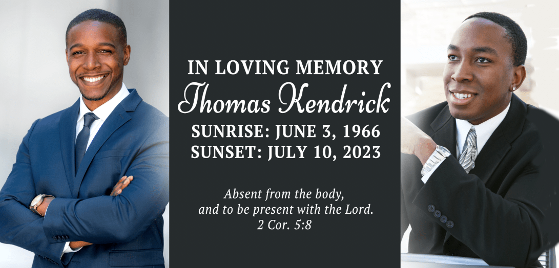
Script Fonts: Grace and Personality
Script or cursive fonts are best used sparingly—for titles, dedications, or significant quotes. They evoke emotion and elegance, but can become difficult to read if used heavily. The Funeral Program Site recommends modest use—like “In Loving Memory” or a favorite verse—so the script adds sentiment without compromising clarity.
Pairing Fonts for Balance
Combining fonts enhances visual harmony and structure. A classic combination is:
-
Serif (body text) + Script (titles) for a balanced hierarchy.
-
Sans-serif (subheaders) + Serif (body text) for clarity and modern warmth.
-
Sans-serif (headers) + Sans-serif (body text) using weights or styles (bold, regular) for a harmonious minimalist design.
Funeral Program Site provides sample pairings that respect readability while honoring personality.
Font Size and Accessibility
Ensure programs remain accessible to all:
-
Titles/subheaders: 18–24 pt, depending on program size.
-
Body text: 11–14 pt serif for comfort and ease of reading.
-
Minimal script text: 16–18 pt, for graceful visibility without strain.
These choices put guests at ease while reading in emotional settings.
Formatting for Emotional Resonance
Consider spacing and alignment:
-
Line spacing (leading): 1.15–1.5 for increased readability.
-
Margins: Comfortable wiping room ensures a grounded, respectful look.
-
Alignment: Justified alignment offers formality; left-aligned leans more personal and modern.
Funeral Program Site offers fluid layouts that help convey structure without sacrificing sentiment.
Sample Templates with Thoughtful Typography
The Funeral Program Site offers curated templates featuring harmonious font combinations. Each template is a polished starting point—professionally designed for clarity, tone, and visual cohesion, helping families create programs that feel both respectful and deeply personal.
Implementation Tips for Print
-
Use fonts optimized for print (avoid screen-only fonts).
-
Embed fonts to preserve layout across printing platforms.
-
Confirm final proofs for consistent rendering—especially scripts.
-
Choose paper with slight texture to enhance elegant fonts.
These steps ensure that final programs reflect thoughtful typography and lasting presentation.
Why Families Trust The Funeral Program Site
Families choose the Funeral Program Site for font and design guidance due to its:
-
Design expertise grounded in emotional clarity.
-
Personalization with purpose, balancing tone and readability.
-
Print-quality assurance, delivering heirloom-ready programs.
-
Empathy-driven support, simplifying choices during a tender time.
This deeply balanced service transforms typography from detail into tribute.
Conclusion
In funeral programs, every word—and how it’s written—carries weight. Font choices speak to legacy, honor, and clarity even amidst quiet grief. With carefully selected fonts, spacing, and pairings, programs become gentle companions that reflect love with readability. Through expert design support, the Funeral Program Site helps families tell stories with grace, feeling confident that every letter reflects care.
About the Author
Christi Anderson is the founder of The Funeral Program Site and an author dedicated to helping families craft meaningful memorials. With years of experience in funeral stationery and personalized tributes, she has helped thousands honor loved ones with dignity, understanding, and elegance. Explore her works and resources on her Amazon Author Page.