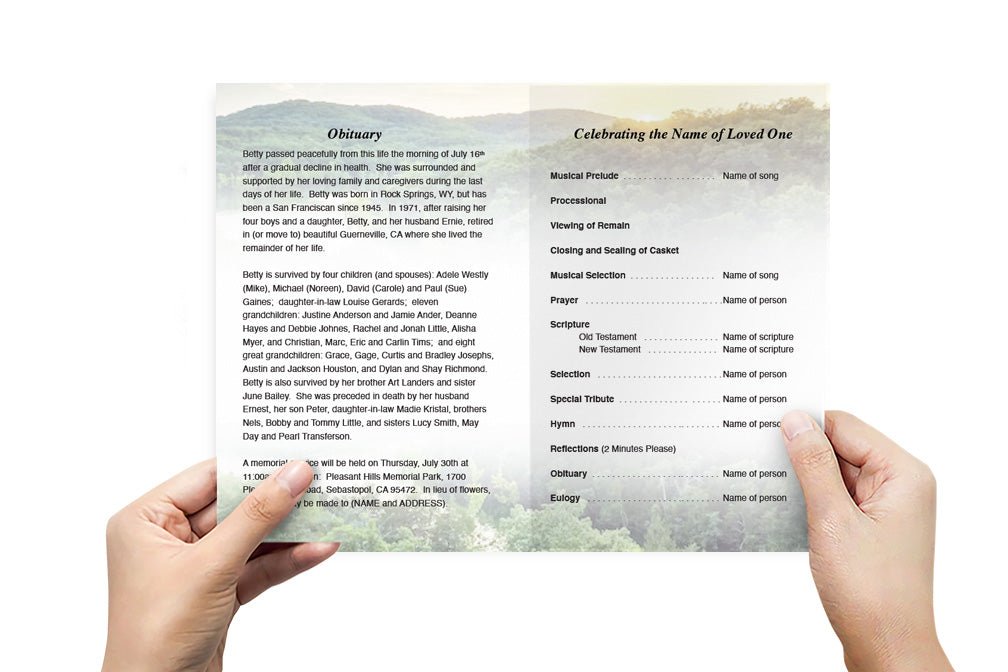
Common Mistakes to Avoid When Creating Funeral Flyers

Essential Tips to Prevent Mistakes in Funeral Flyer (Funeral Program) Design
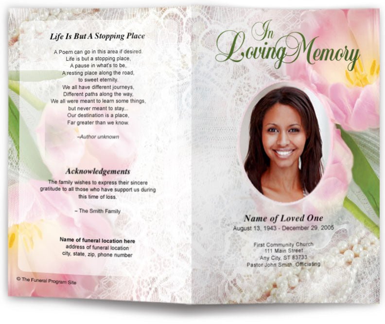
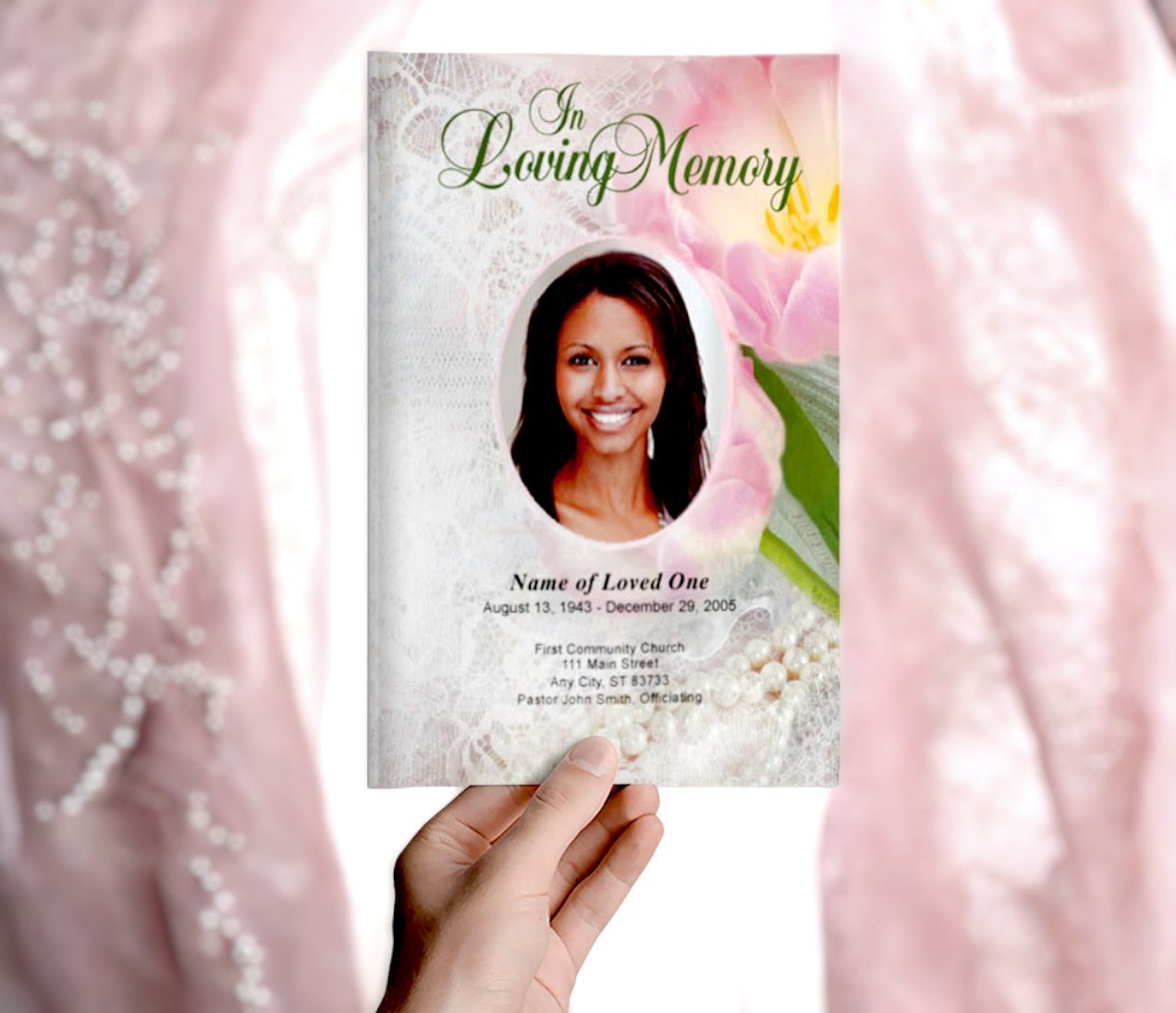
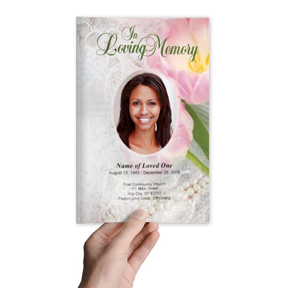
Creating a funeral flyer is a meaningful task that requires attention to detail and sensitivity. A well-designed flyer serves as both a guide to the memorial service and a cherished keepsake for family and friends. However, there are common mistakes that can detract from its effectiveness and emotional impact. To ensure that your funeral flyer is both beautiful and appropriate, it’s important to be aware of these potential pitfalls. This guide highlights common mistakes to avoid when designing funeral flyers and offers tips for creating a thoughtful and polished tribute.
1. Overloading the Flyer with Text
One of the most common mistakes in designing funeral flyers is trying to include too much text. While it’s important to provide key details and meaningful content, overcrowding the flyer with lengthy paragraphs can make it difficult to read and detract from its visual appeal.
How to Avoid Text Overload
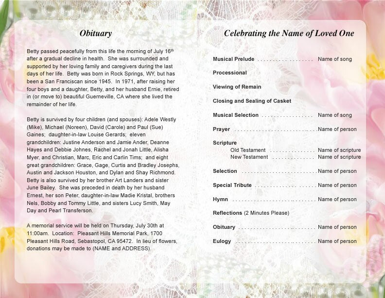
- Keep the content concise and focus on the most important information, such as the order of service, a brief obituary, and a meaningful quote.
- Use bullet points, short paragraphs, and subheadings to break up text and improve readability.
- Ensure there is enough white space on the flyer to create a clean and organized look.
2. Using Low-Quality Images
Including a photo of the deceased is a powerful way to personalize a funeral flyer. However, using low-quality or pixelated images can detract from the flyer’s professionalism and impact. High-quality images help create a polished and respectful tribute.
Tips for Choosing the Right Images
- Select a high-resolution photo that is clear, well-lit, and captures the essence of the deceased’s personality.
- Avoid using small or blurry images that may become pixelated when printed.
- If possible, use a professional photo or a cherished family portrait that holds sentimental value.
3. Choosing Inappropriate Fonts
The choice of fonts can significantly affect the readability and overall look of a funeral flyer. Using fonts that are too decorative or difficult to read can make it challenging for attendees to understand the information being presented.
Guidelines for Font Selection
- Choose simple and easy-to-read fonts for the main text, such as Times New Roman, Arial, or Calibri.
- For headings or quotes, you can use more decorative fonts, but ensure they are still legible.
- Avoid using more than two different fonts on the flyer to maintain a cohesive and polished look.
4. Ignoring the Importance of White Space
White space, or negative space, is the area of the flyer that is left blank. Many designers overlook the importance of white space, leading to cluttered and overwhelming layouts. Proper use of white space enhances readability and allows key elements to stand out.
How to Effectively Use White Space
- Leave ample margins around the edges of the flyer and between different sections of content.
- Avoid cramming too much information into a small area; prioritize the most important details.
- Use white space strategically to guide the reader's eye through the flyer in a logical and aesthetically pleasing way.
5. Failing to Proofread Carefully
Errors in spelling, grammar, or factual information can be distressing for the family and disrespectful to the deceased. Failing to proofread the flyer carefully is a common mistake that can easily be avoided.
Proofreading Tips
- Have multiple people review the flyer to catch any errors or inconsistencies.
- Double-check the spelling of names, dates, and important details to ensure accuracy.
- Read the flyer out loud to catch any awkward phrasing or grammatical mistakes.
6. Overusing Colors or Clashing Color Schemes
While color can add a beautiful touch to a funeral flyer, overusing it or choosing clashing color schemes can create a confusing and unprofessional look. It’s important to use colors that complement each other and fit the tone of the service.
Tips for Choosing the Right Colors
- Select a color palette that is soft and calming, such as pastels or neutral tones, for a traditional and respectful look.
- If you use an accent color, make sure it matches the overall theme and is used sparingly.
- Avoid overly bright or contrasting colors that can be distracting or overwhelming.
7. Neglecting to Align Content Properly
Misaligned text, images, or design elements can make a funeral flyer look unprofessional and hastily put together. Ensuring that all elements are properly aligned is crucial for a polished and cohesive design.
How to Achieve Proper Alignment
- Use design software that offers gridlines or alignment tools to ensure elements are correctly positioned.
- Align text and images consistently throughout the flyer for a unified look.
- Double-check that margins are even and that no text or images are cut off or misaligned.
8. Skipping a Test Print
What looks good on a computer screen may not always translate well to print. Skipping a test print can result in unexpected issues, such as color discrepancies, cut-off text, or low-resolution images.
Importance of Doing a Test Print
- Print a sample copy to check for any errors or adjustments that need to be made.
- Review the test print for color accuracy, clarity of images, and overall layout.
- Make any necessary adjustments before proceeding with the full print run.
Conclusion: Avoiding Common Pitfalls in Funeral Flyer Design
Creating a funeral flyer that is both respectful and visually appealing requires careful attention to detail. By avoiding common mistakes such as overloading the flyer with text, using low-quality images, or neglecting to proofread, you can ensure that the flyer serves its intended purpose as a thoughtful tribute to the deceased. Take the time to plan the design carefully, review it thoroughly, and choose elements that truly reflect the spirit and legacy of your loved one.


