Crafting Funeral Programs That Comfort & Honor

When a person dies, a funeral program becomes one of the most tangible, enduring artifacts that remain. It’s both a guide for those attending the service and a keepsake for those who love the deceased. Especially in moments of grief, details matter. A thoughtful program helps bring clarity, beauty, and meaning. In this article we’ll explore what makes a funeral program effective and touching: what to include, design best practices, how to avoid missteps, recent trends, and how using a trusted service like Funeral Program Site can simplify the work while preserving dignity.
1. Why Funeral Programs Are Important
Funeral programs are powerful for several overlapping reasons:
-
Orientation for mourners: They help people understand what will happen—readings, hymns or songs, speakers, rituals. This is especially helpful for guests unfamiliar with the faith or cultural traditions.
-
Honor & remembrance: They collect biographical information, photos, favorite poems or quotations; they make visible the story and personality of the departed.
-
Keepsake: Attendees often save the program long after the service—it becomes a physical connection to memory.
-
Comfort & ritual: In grief theory, rituals and tangible artifacts help people process loss, giving structure, meaning, and something to hold.
Providers, funeral homes, and memorial design experts all agree: while the funeral service is central, the program plays a supporting role that shapes how people perceive and remember the service. It’s not just content; it’s comfort.
2. What Should Be in a Funeral Program: Core Components
Based on best practice sources and design guides, a funeral program generally should include the following. Depending on culture, religion, length of service, and family preferences, some items may be added or omitted—but these are the core.
| Component | Purpose / What It Adds |
|---|---|
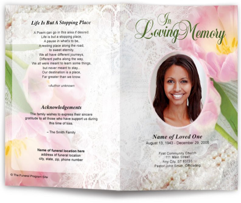
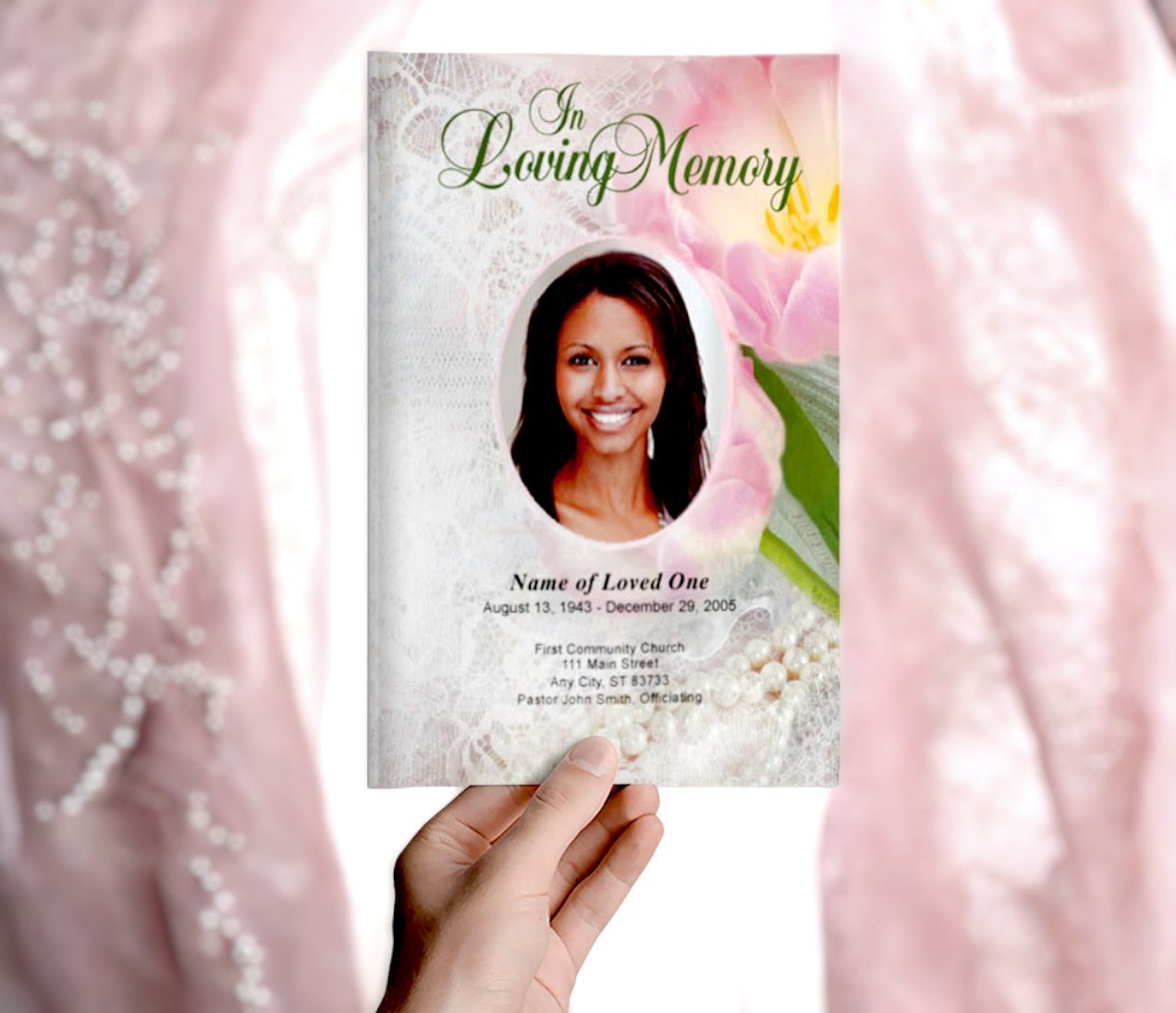
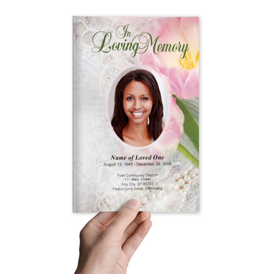
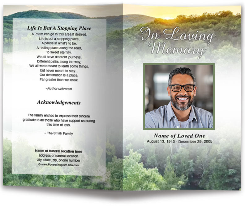
| Cover Page | Name (often full name), birth and death dates, a photograph (formal or candid), and perhaps a subtitle (e.g. In Loving Memory or Celebration of Life). Sets tone. |
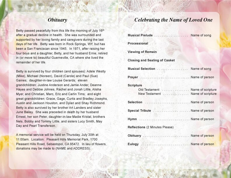
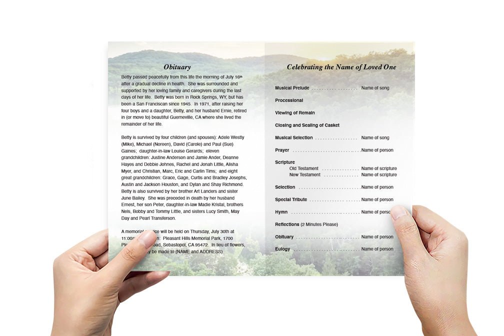
| Order of Service | Sequence of events: processional, prayers/readings, music/hymns, speaker(s), eulogy, benediction, recessional. Helps guests follow along. |
| Biography / Obituary | Life highlights: family, work, passions, places lived, personality. Gives context—to those who didn’t know, and helps those who did celebrate full life. |
| Photographs | High-quality images, ideally covering various life stages. Formal portraits + candid moments often give full texture. |
| Readings, Poems, Scriptures, Quotes | Personal or traditional selections reflect values, beliefs, memories. They also provide comfort and reflect what was meaningful. |
| Music or Hymns | Titles, artists or performers; sometimes lyrics if shared by congregation or for reflection. Music evokes emotion. |
| Participants | Names and roles of officiant, readers, eulogist, musicians. Recognizes those who contribute and helps attendees know who is speaking. |
| Acknowledgments / Thank You | Recognizes support given by friends, family, clergy, funeral home staff. Helps family express gratitude. |
| Practical Details | Time, date, venue(s), officiant, reception location if any, directions or parking notes. Ensures people are where they need to be. |
| Keepsake / Closing Message | Final prayer, poem, quote, epitaph. Something that lingers in memory after the service. |
Sources like Meadow Memorials and Compassion Cremations outline the importance of these components. meadowmemorials.com+2compassioncremations.com+2
3. Design Best Practices: Clarity, Respect, Beauty
Putting content together is only half the job; design has to support both function and emotion.
Layout & Format
-
Choose what size/format the program will be: single page, bifold, trifold, booklet, gatefold. Each has trade-offs in terms of how much content fits comfortably.
-
Use a hierarchical layout: cover (name & photo) first, then inside pages for order of service, bio, etc., back cover for acknowledgements or closing.
Fonts & Typography
-
Limit to two or three fonts: e.g., a serif (for headings or titles), a clean serif or sans-serif for body. Avoid overly decorative fonts for main body text.
-
Use appropriate sizes: headings should be larger; body text legible, especially for older attendees.
Imagery & Photo Quality
-
High resolution photos matter. Blurry or grainy images can feel like a mismatch with the importance of the moment.
-
Balance photo placement: a strong cover photo, but avoid letting images overshadow text content.
Color & Symbolism
-
Muted, softer color schemes often feel more respectful. Neutrals, pastels, gentle tones.
-
But personalization is important: if the deceased had a favorite color, favorite motif, or symbol (religious emblem, hobby), appropriate use can add meaning.
White Space & Readability
-
Don’t try to cram too much content in small space. White space (blank space) helps ease reading, reduces visual fatigue.
-
Maintain margins, safe zones for printing so nothing gets cut off in folds or binding.
Print vs Digital
-
If offering printed programs, select paper quality and finish (e.g. matte, satin) that feels substantial and handles handling well.
-
For digital versions, ensure file formats are accessible, optimized for screen, easy to download or share.
4. Common Mistakes & How to Avoid Them
These are pitfalls often encountered; being aware helps you avoid grief added by avoidable errors.
| Mistake | Consequence | How to Prevent |
|---|---|---|
| Misspelled names or wrong dates | Can cause painful distress; looks careless | Proofread thoroughly; involve more than one person; double check official documents ⭐ |
| Low-quality photos (low resolution, stretched, pixelated) | Detracts visually; reduces sense of dignity | Use original high-res images; avoid overzoom; preview images in template before printing |
| Overcrowded design | Hard to read; people may skip reading; feels overwhelming | Prioritize essential content; don’t overload; use white space; consider fewer photos if needed |
| Inconsistent style (mixing too many fonts, colors, motif styles) | Looks unbalanced, amateur | Pick a style guide; choose color palette, font families early; stick with them throughout |
| Ignoring margins/folds/safe zones | Portions of text or images get trimmed or misaligned | Use templates that show safe zones; request mockups; test printing proof if possible |
| Last-minute changes | May delay printing; increase cost; cause mistakes | Start early; finalize content before design; allow time for proofing and printing |
| Neglecting digital or remote attendees | Some important people feel left out | Provide digital or PDF versions; maybe email or share via memorial website; include contact info online |
5. How to Get Started: Workflow & Timeline
A suggested workflow helps ensure you don’t overlook anything, and gives space for changes.
-
Gather Content
Collect photos, full name, dates, family relationships, important life events/hobbies, readings or music choices, speakers, quotes. -
Choose Style & Format
Decide what format feels appropriate, what style (traditional, modern, themed), what motif or symbols matter. -
Pick Template or Design
If using a provider or site with templates, pick one that matches your style and allows the content you’ve collected. A good template will include safe zones and layout for fold/booklet. -
Populate Template
Insert photos, text; make sure wording is final. Adjust image positions; choose fonts; select colors; ensure spacing. -
Proofing & Review
Review for spelling, names, sequence of service, photo quality. Have one or more trusted people (not emotionally exhausted) check. Preview digital and/or print proof. -
Finalize & Print / Digitize
Once content/design is approved, decide on printing: quantity, paper weight/finish. Order early enough. Also prepare digital version for sharing. -
Distribution
Distribute physical programs at service (on seats or handed out). Make digital versions available for those who couldn’t attend. Save extra copies for family keepsake. -
Archive
Keep digital files; keep physical copies; sometimes revisit years later. A program can become part of family history.
6. Trends & Innovations in Funeral Program Design
The world of memorials is evolving. Families and designers are creating programs that are more personal, more accessible, and more creative.
-
Hybrid digital/print models: Programs that exist both as printed booklets and digital PDFs or web pages. QR codes sometimes included for photo galleries or livestreams.
-
Keepsake-styled designs: Smaller books, memorial cards, bookmarks, special toned or textured paper, all forming part of remembrance sets.
-
Personal themes & strong photo-centric layouts: More candid shots, life in motion, hobby or travel photos; more emphasis on personality than formal portrait alone.
-
Accessible design: Larger fonts, high contrast, readable color combinations; consideration of disability or aging vision.
-
Eco-friendly materials: Sustainable paper, less gloss (which may use more chemicals), more minimalist printing packaging.
-
Customization of symbols or motifs: Instead of generic borders, families increasingly include icons meaningful to the person: plants, animals, religious or cultural symbols, favorite items.
Many of these trends are supported by design-guidance content from sources like Compassion Cremations, Printivity, and others. compassioncremations.com+2printivity.com+2
7. How a Professional Service Helps: What Funeral Program Site Offers
Going through the process can be hard during grief. Here’s how using a professional service like Funeral Program Site can ease the burden and ensure excellence.
-
Template library: Many layout options already designed to include all the essential components; helps ensure nothing crucial is missed.
-
Customization tools: Ability to upload images, add personal text (quotes, biography), select fonts, adjust color schemes, choose finish/style.
-
Professional print quality: Ensures photo resolution is sufficient; colors are reproduced well; paper and finishing meet high standards.
-
Proofing & review process: Before printing, clients often receive proofs to check layout, photo placement, spelling etc.
-
Digital versions: Along with printed programs, digital formats for sharing with those who cannot physically attend.
-
Empathy & support: Understanding that families are under stress; clear communication; timelines; customer service that helps if mistakes or changes come up.
Using such a service reduces risk, preserves quality, and gives families more emotional space to focus on the memorial itself rather than printing details.
8. Practical Tips & Small Details That Make a Big Difference
Here are some often-overlooked details that can improve the final program significantly:
-
Use the full legal name and preferred name/nickname if appropriate, especially in the photo caption or subtitle.
-
For dates, format consistently (month, day, year) and verify accuracy.
-
If listing multiple speakers or musicians, include their names and a brief descriptor if helpful (“friend,” “daughter,” etc.).
-
Choose photo backgrounds carefully: avoid busy backgrounds behind text; if necessary, use overlays or shade the background.
-
Include music/song titles and, if possible, artist or performer names. Some families also include lyrics or excerpted verses.
-
Consider blank space or a small note area in some designs (“In lieu of flowers…,” “Donations may be made to…,” “Reception to follow at…”).
-
Think about how program feels in hand: paper weight, folding type. Programs that are too flimsy may tear; ones with too thin paper can feel less respectful.
-
If printing double-sided or folding, make sure pagination and layout align properly; ensure no content is lost in fold or binding.
-
For remote or out-of-town friends/family, having digital image or PDF helps; ensure they receive it in timely fashion.
-
Store the design files and extra printed copies for family keepsakes; later anniversaries often bring the desire to revisit physical artifacts.
9. Real-World Examples & What Makes Them Effective
Examining real examples helps show what works. For instance, design galleries from sources like Meadow Memorials illustrate programs that balance photo prominence with readable content, carefully spaced segments (readings, eulogy), and thoughtful acknowledgments. meadowmemorials.com
Compassion Cremations offers content showing how including meaningful imagery (nature, hobbies), simple color palettes, and clean typography contribute to programs that feel both elegant and personal. compassioncremations.com
Printivity’s guides show that despite design complexity, printing technical matters (proper file formats, paper choices, proofing, etc.) often determine whether the final product feels polished or compromised. printivity.com
These examples share common qualities:
-
The cover photo is strong and emotionally resonant.
-
The order of service is easy to follow—clear headings, logical sequence.
-
Typography choices are consistent; color accents are subtle but meaningful.
-
Personal touches (quotes, hobbies, photos) that distinguish the program from something generic.
10. Measuring Success: What Makes a Program “Good”
After the service, how do people know whether the program achieved its purpose? Here are some mark-ers of success:
-
The program had no factual errors (names, dates, sequence).
-
Guests commented that they could follow the service well.
-
The design resonated with people—“It felt like them,” “reflects who they were.”
-
Physical artifacts (programs) are kept by family or attendees.
-
Digital versions are shared and appreciated by those who could not attend.
-
The program fulfilled both its functional role (guiding the service) and its memorial role (honoring the person).
These outcomes don’t always show up immediately, but are referenced in client feedback and memorial reviews.
11. Summary: What Matters Most When Crafting a Funeral Program
Putting it all together, success in designing a funeral program rests on several pillars:
-
Careful content gathering (names, photos, quotes, service order).
-
Thoughtful design: readable typography, layouts that make sense, photo quality, good color choices.
-
Avoiding oversights: proofing, testing margins/folds, ensuring all parts are legible.
-
Personalization: letting the life, personality, values of the deceased shine through.
-
Good printing / material choice, plus digital sharing if needed.
-
Working with a provider or tool that supports all these—empowers customization, offers quality, communicates well, delivers on time.
12. Final Thoughts
A funeral program may seem like a small item in the larger scope of a memorial service, but often it is one of the elements that linger. It gives shape to the ceremony, grounds the memory, and offers something tangible to those who grieve. Designing a program with intention, care, accuracy, and love turns it into more than paper—it becomes part of how we remember.
If you find yourself planning or helping plan a service, using experienced services like Funeral Program Site can take much of the technical burden off your shoulders, letting you focus on what matters most—honoring the life, connecting with family, and holding space for grief and memory.
Author Bio
Funeral Program Site is the author. With many years of experience in memorial stationery, print design, and grief care, the team has helped countless families create funeral programs that honor stories, reflect love, and preserve memory. Their work combines design expertise, care for detail, and deep respect for every individual’s journey. View the author’s profile on Amazon at https://www.amazon.com/author/funeralprogramsite


