How Can I Ensure My Funeral Program Is Easily Readable For Attendees?

A funeral program serves as both a guide for the service and a keepsake for attendees. While design elements add beauty and personalization, readability is crucial to ensure that guests can comfortably follow along. Factors such as font choices, layout, contrast, spacing, and print quality all contribute to how easily the program can be read. Below are essential tips to ensure your funeral program is clear, professional, and easy to read for all attendees, including elderly guests or those with visual impairments.
1. Choose Legible Fonts for Easy Reading
The right font choice makes a significant difference in clarity and readability.
Best Font Choices:
- Serif Fonts (e.g., Times New Roman, Georgia) – Great for traditional funeral programs, offering a timeless, elegant feel.
- Sans-Serif Fonts (e.g., Arial, Helvetica, Calibri) – Ideal for a modern, clean look and excellent readability.
- Script or Calligraphy Fonts – Should be used sparingly for headings or quotes, as they can be hard to read in body text.
Font Size Guidelines:
- Headings & Titles: 18pt – 24pt
- Body Text: 12pt – 14pt (Avoid anything smaller than 11pt)
- Quotes or Scriptures: 14pt – 16pt (Make sure they stand out but remain readable)
2. Maintain Proper Spacing and Alignment
Good spacing ensures text does not feel cluttered or overwhelming.
Key Spacing Tips:
- Line Spacing: Set to at least 1.5x or 2x for better readability.
- Margins: Keep at least 0.5 to 1-inch margins around the edges.
- Justification: Use left-aligned text for easy reading (fully justified text may create uneven spacing).
- Paragraph Breaks: Separate sections with clear breaks to avoid overwhelming blocks of text.
3. Use a High-Contrast Color Scheme
A clear contrast between text and background enhances readability, especially for elderly attendees.
Best Color Combinations:
- Black text on white or ivory (Classic and high contrast)
- Dark blue or charcoal text on light backgrounds (Elegant and easy on the eyes)
- Gold or silver accents (For headings, not body text)
Avoid These:
- Light-colored text on light backgrounds (e.g., beige on white, pale gray on ivory)
- Bright or neon colors (Hard to read in low-light settings)
- Low-contrast color pairs (E.g., yellow on white or light gray on silver)
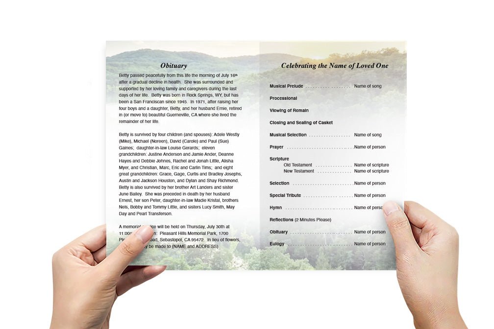
4. Organize the Layout for Easy Navigation
A well-structured layout helps attendees find information quickly.
Suggested Layout Structure:
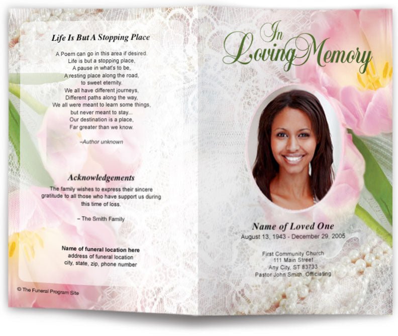
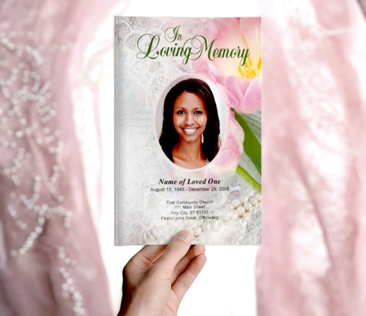
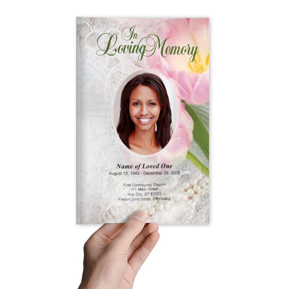
- Front Cover – Name, birth & passing date, meaningful image, and a quote.
- Order of Service – Clearly list the schedule in a logical flow.
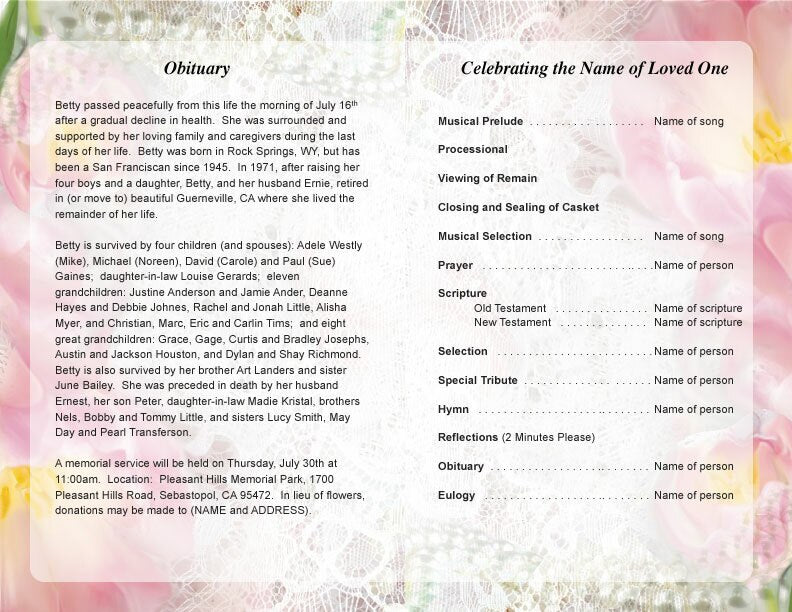
- Obituary & Life Story – Use readable paragraphs and avoid overly dense text.
- Photos – Keep them clear and appropriately sized (avoid small, cluttered images).
- Back Cover – Closing message, acknowledgments, and funeral details.
5. Select High-Quality Printing for Sharp Text
The printing process affects how legible the text appears on the page.
Printing Best Practices:
- Use High-Resolution Printing – Choose at least 300 DPI for crisp text.
- Select Matte or Glossy Paper – Matte reduces glare, while glossy enhances images.
- Consider Large-Print Versions – Provide a large-print version (16pt+ font size) for elderly attendees.
6. Use Bullet Points and Bold Text for Key Details
To highlight important details:
✅ Use bold headings to break up sections.
✅ Add bullet points or numbered lists for easy reading.
✅ Use italics for scripture quotes or poem excerpts.
7. Test Readability Before Printing
Before finalizing the program:
✔ Print a test copy and check readability in different lighting conditions.
✔ Ask multiple people (especially elderly guests) to review and provide feedback.
✔ Read from a distance to ensure clarity from various viewing angles.
Conclusion
To create an easily readable funeral program, focus on clear fonts, appropriate spacing, high-contrast colors, structured layouts, and high-quality printing. These thoughtful design choices ensure attendees can comfortably follow along, making the program both a functional guide and a treasured keepsake.