How to Choose Fonts for a Funeral Program Template
Christi Anderson
Fonts may seem like a small design choice, but they play a powerful role in how a funeral program looks and feels. The right typography communicates respect, readability, and personality, while poor font choices can make a program difficult to read or appear unprofessional. Families designing their own funeral program templates often ask: Which fonts should I use? The answer depends on balancing elegance with clarity. With professional guidance and templates from the Funeral Program Site, families can confidently choose fonts that elevate their programs into keepsakes that honor loved ones with dignity.
Why Fonts Matter in Funeral Programs
Typography is more than decoration—it affects the tone of the service. Fonts convey emotion, guide the reader’s eye, and create hierarchy within the program. For example:
-
Script fonts suggest elegance and formality, often used for names or headings.
-
Serif fonts (like Times New Roman or Garamond) feel traditional and are easy to read in print.
-
Sans serif fonts (like Arial or Helvetica) provide modern simplicity and clean readability.
The fonts you select should reflect the personality of the loved one while ensuring that attendees can follow the text easily during the service.
Best Practices for Choosing Fonts
1. Limit to Two or Three Fonts
Too many fonts create visual clutter. A good rule of thumb is:
-
One decorative font for titles or headings.
-
One readable font for body text.
-
Optionally, a third complementary font for accents like quotes or poems.
2. Prioritize Readability
Funeral programs contain important details like service order, hymns, and tributes. Guests should be able to read them without strain. Use clear serif or sans serif fonts for body text at a size of 11–12 points.
3. Match the Tone of the Service
Fonts can subtly reflect the loved one’s personality:
-
Script or calligraphy fonts suit formal or traditional services.
-
Modern sans serif fonts suit contemporary or minimalist services.
-
Playful yet elegant fonts may reflect a joyful “celebration of life.”
4. Avoid Overly Ornate Fonts for Large Blocks of Text
While decorative fonts are beautiful, they are best reserved for short phrases. Long passages in script fonts become difficult to read.
5. Use Consistent Styling
Maintain consistency in font choices throughout the program. Titles, headings, and body sections should follow the same hierarchy for a polished, professional appearance.
Common Fonts for Funeral Programs
Some fonts have become popular choices for memorial stationery due to their elegance and clarity:
-
Headings and Names: Edwardian Script, Great Vibes, Lucida Calligraphy, or Zapfino.
-
Body Text: Garamond, Times New Roman, Baskerville, Palatino, or Georgia.
-
Modern Choices: Helvetica, Arial, or Open Sans for a clean, contemporary look.
Pairing a decorative font with a classic body font often produces the most balanced results.
Typography for Specific Sections
Different sections of the program may call for different typographic treatments:
-
Front Cover: The deceased’s name in a decorative script font, with dates in a simple serif font.
-
Order of Service: Clear serif or sans serif font for readability.
-
Obituary: Serif font for traditional, narrative text.
-
Poems or Quotes: Slightly italicized or styled with a third complementary font.
-
Acknowledgments: Smaller size but still readable, often in the same font as the body text.
This approach ensures hierarchy, guiding the reader’s eye naturally from section to section.
Printing Considerations
Fonts look different on screen than in print. Always print a test copy before finalizing your program. Check for:
-
Font size readability in various lighting conditions.
-
Proper spacing between lines and paragraphs.
-
Contrast between text and background colors.
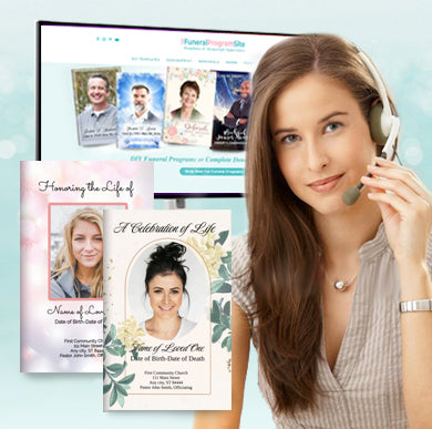
Professional printing services guarantee crisp, sharp typography, ensuring fonts appear as intended. Providers like the Funeral Program Site specialize in designing and printing funeral programs with typographic balance, helping families avoid common mistakes.
Final Thoughts
Fonts may not be the first thing families think of when creating a funeral program, but they greatly influence both appearance and readability. Choosing two or three fonts that balance elegance with clarity ensures that the program not only looks beautiful but also serves its purpose as a guide and keepsake.
For families who want professional-quality templates and expert guidance, the Funeral Program Site offers carefully designed layouts that pair fonts harmoniously, saving time and reducing stress. By choosing fonts thoughtfully, families can create programs that are both visually dignified and deeply meaningful.
About the Author
Christi Anderson is the founder of The Funeral Program Site and an author dedicated to helping families create meaningful memorials. With years of experience in funeral stationery and personalized tributes, she has guided thousands of families through the process of honoring their loved ones with dignity. Explore her books and resources on her Amazon Author Page.