Top Fonts and Layout Tips for a Professional Funeral Booklet
Christi Anderson
Creating a funeral booklet is a delicate and meaningful task, one that allows families to honor their loved one while providing a guide for attendees. Beyond the content itself, the design choices—specifically fonts and layout—play a vital role in shaping the overall tone and readability of the piece. In this article, we’ll explore the best fonts to use, how to structure your pages, and tips to ensure your funeral booklet maintains both elegance and clarity.
Why Fonts and Layouts Matter
Fonts and layouts aren’t just aesthetic decisions; they directly impact how the content is received. A well-chosen font conveys respect and solemnity, while a clean layout helps attendees follow the service and reflect comfortably. Missteps in typography or poor spacing can distract from the tribute and even create confusion during the event.
For example, using a traditional serif font like Times New Roman may convey timeless respect, while a modern sans serif like Helvetica lends a contemporary, clean look. Pairing the right font with an organized structure enhances readability and evokes emotion in harmony with the service.
Recommended Fonts for Funeral Booklets
Choosing the right font is crucial. Here are a few commonly used and effective options:
1. Times New Roman
A timeless serif font ideal for long paragraphs such as obituaries or tributes. It adds a formal, traditional touch.
2. Garamond
Elegant and classic, Garamond is easy to read and adds warmth and sophistication.
3. Georgia
Slightly more modern than Times New Roman, Georgia is a strong option for print readability.
4. Helvetica
A clean sans-serif option best used for headings or minimalist designs. It gives a contemporary, clutter-free appearance.
5. Calibri
Professional yet approachable, Calibri is often used for body text and balances modernity with simplicity.
6. Script Fonts (used sparingly)
Fonts like Edwardian Script or Great Vibes can be used for names or quotes. Use sparingly to avoid legibility issues.
Avoid decorative or whimsical fonts like Comic Sans or Papyrus, as they detract from the tone of remembrance.
Font Pairing Tips
Pairing two fonts can add visual interest and create a hierarchy of information. Here are a few safe combinations:
-
Heading (Georgia) + Body (Garamond)
-
Heading (Helvetica Bold) + Body (Times New Roman)
-
Heading (Script) + Body (Serif)
Stick to no more than two font styles in the entire booklet to maintain cohesion.
Ideal Font Sizes
To ensure readability across different printing formats:
-
Title/Name: 24-36 pt
-
Section Headers: 16-20 pt
-
Body Text: 11-13 pt
-
Captions/Photo Descriptions: 9-10 pt
Layout Tips for a Professional Finish
The layout sets the framework for your content. Thoughtful structure ensures your funeral booklet looks organized and heartfelt.
1. Use a Grid System
Divide your page using invisible guides. This helps keep photos, text, and headers aligned.
2. Maintain Consistent Margins
Use equal margins (0.5” to 1”) to create white space that enhances visual comfort.
3. Balance Text and Photos
Don’t overwhelm the pages with too many images or blocks of text. Aim for visual harmony.
4. Follow a Logical Order
Use the following sequence:
-
Cover page (name, dates, photo)
-
Order of Service
-
Obituary/Life Story
-
Readings/Poems
-
Photo Collage
-
Acknowledgments
5. Use Section Breaks
Subtle lines, larger headings, or spacing can help break up content and guide the reader.
6. Color Choices
Stick to monochromatic or soft color palettes. Black text on white or ivory backgrounds ensures high contrast and readability.
Tools That Make Layout Easier
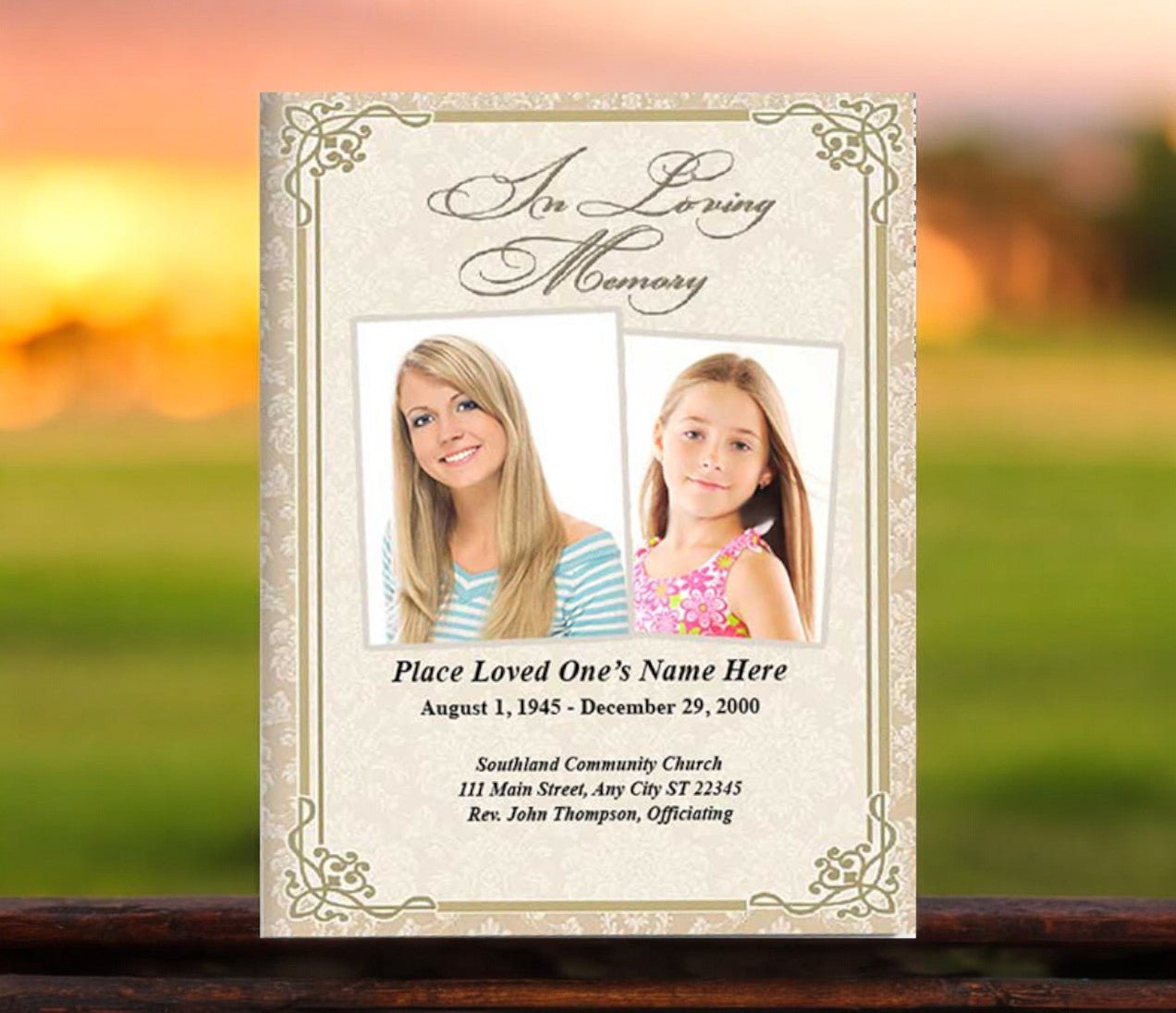
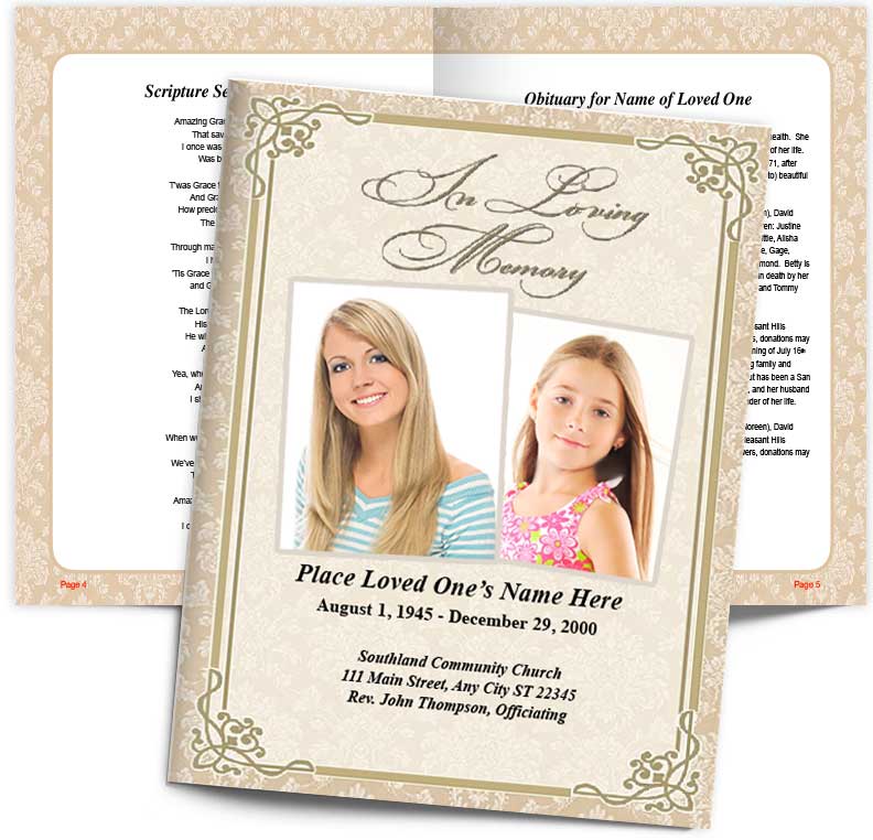
Many templates available online already follow strong design principles. This funeral booklet template is one such example, offering balanced spacing and professional typography.
Another example is this funeral booklet design that uses clean headers, classic fonts, and thoughtful white space to allow for easy reading and emotional resonance.
Final Thoughts
Fonts and layout may seem like small design details, but they profoundly influence how a funeral booklet is received. A carefully selected font and an orderly, respectful layout help create a keepsake that feels dignified and personal. Whether you’re designing from scratch or using a template, keep your focus on readability, visual harmony, and emotional tone.
With online resources like The Funeral Program Site and tools like Word or Canva, families can confidently design booklets that honor their loved one with grace and style.
Author Bio
Christi Anderson is the founder of The Funeral Program Site and a published author with years of experience in memorial design. She offers compassionate guidance and expert insight to families seeking meaningful funeral tributes. Visit her Amazon Author Page to explore her books and resources.